C-store design for a modern world: Q&A with CTM's Devin Mahaffey

Devin Mahaffey, president of the CTM Design, has seen a lot of changes first hand in the c-store space. Back when his Calgary-based company first began 30 years ago, it was a different landscape. Convenience stores had limited offerings and few amenities. He and his firm have been able to lead the way in reimagining c-stores to meet the evolving needs of modern consumers, operators and franchisees. We caught up with him for a peek back—and forward—about what’s in store.
CSNC: How have convenience stores changed over the years?
DM: There’s definitely much more competition now. Back then, they were often small spaces with limited offerings. Now c-stores are quite expansive with various profit centres. There’s a big push right now to offer hot food, like we’re seeing with operators like 7-Eleven and Circle K. They’ve expanded to provide more opportunities for their customers to get the things they need.
CSNC: What’s influencing your decisions now about design?
DM: We consider a lot more things, especially those related to customer interaction. Our clients are spending money on washrooms, for example. They used to be afterthoughts and the aim was to spend as little as you could. Now, convenience stores are investing to retain the client in store much longer.
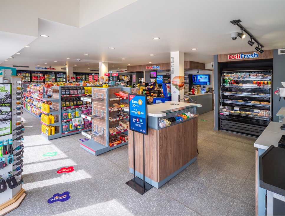
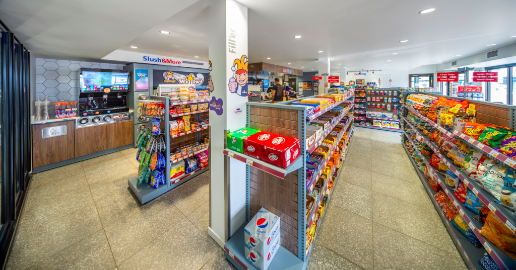
Flow is important—how to move customers within the space to get them to key areas where they can invest their dollars while they're there. The thought process includes what you put front and centre and how to catch their eye to drive them through the whole space. The worst thing for customers to come in and go straight to the pay point or sales counter, then avoid 90% of the rest of the store.
Our interior designers are talking with our clients about current design trends. They're engaged in discussions about revamping stores on a much more frequent basis. Those discussions are about revisiting those profit centres and the touch-and-feel aspect of stores. It’s a much more common topic than it used to be.

CSNC: Can you talk more about those touch and feel aspects?
DM: They are really important—lighting, for example. There was a time when we did store design and wouldn't give lighting a second thought. Nowadays, we're running lighting analysis, and following retail space guidelines to ensure products are lit in a way that grabs a customer’s attention. It also includes the aesthetics around coffee and food—clean design, a wide variety of options, including the addition of health foods and fresh food products. They need to be presented in a manner that really pops.
CSNC: What have you seen that’s new and notable in design?

DM: We did a recent project in Banff. The client really thought about why visitors were coming to that destination—not just the building's architecture. They had a higher-end coffee offering and a free bottled water fill-up station. They had top-end washrooms, toilets with heated seats and everything was hands-free. They focused on what they knew those particular clients were looking for. They really went out of the box.
CNSC: What will we be seeing more of in the future?
DM: There’s more attention being paid to picking materials and finishes that can make a store look newer and cleaner longer with less effort from an operational standpoint. There has been a lot of focus on picking those, especially more premium finishes, than we've seen in the past.
There’s also lots of talk about automation and less necessity for the interaction with someone that's working at the pay point counter as an example. But, I mean, I think to some degree some of that's going to be limited as well. We're always going to need, from a safety standpoint, somebody physically there.

