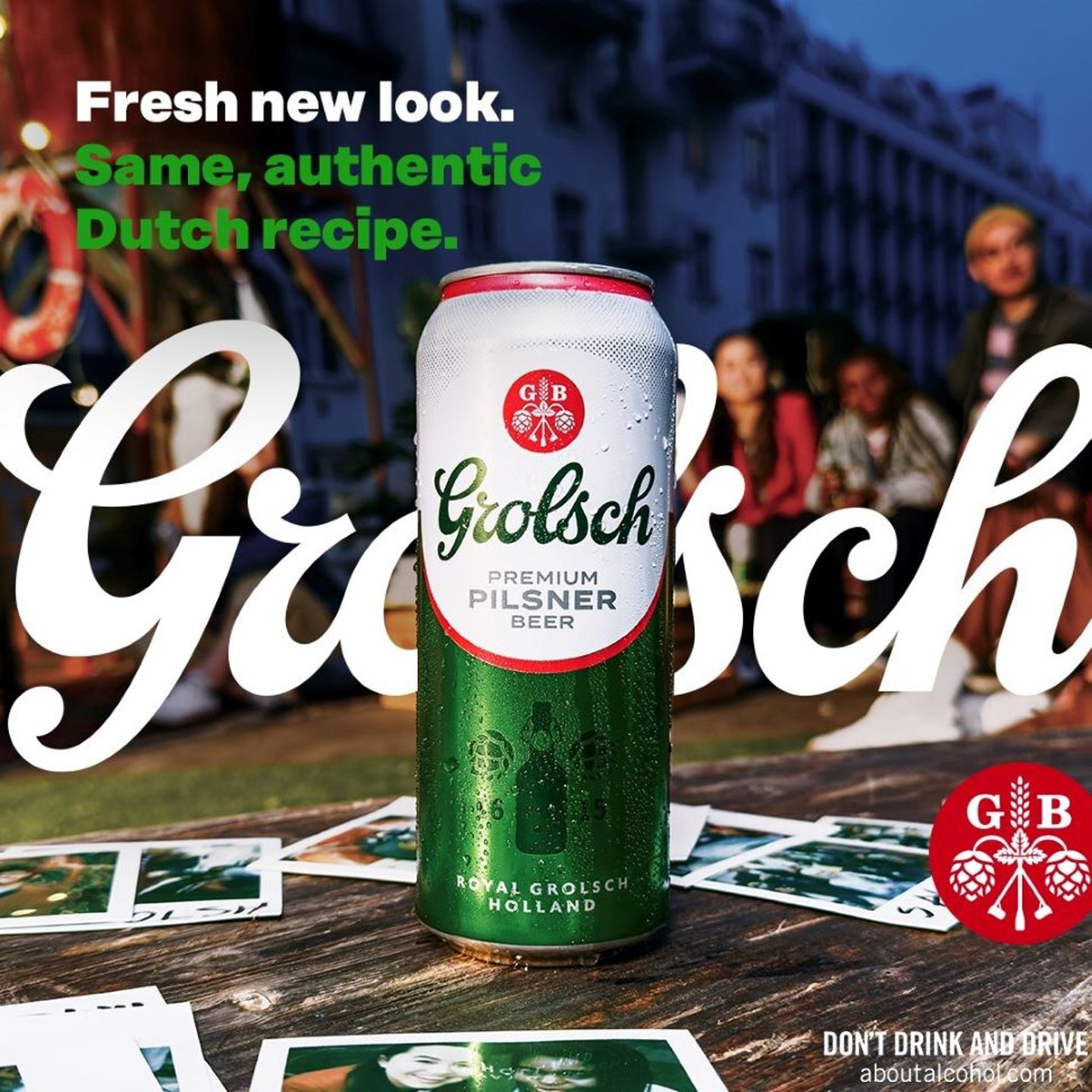
Grolsch launches new visual brand identity for Canada
Ontario beer drinkers will discover on the shelves of The Beer Store and the LCBO a new brand identity for Grolsch, one the brewer says emphasis the brand’s history and its commitment to authenticity, quality and innovation.
The unveiling of the new visual brand identity signifies Grolsch's dedication to optimizing consumer experiences. Informed by what the company says was extensive consumer research, the refreshed visual brand identity embodies distinctiveness, memorability, and new visual appeal. These updates not only differentiate Grolsch from competitors, but also elevate its presence on shelves, embodying a premium aesthetic for consumers.
With the iconic wordmark reverting to its green hue, red heritage mark, and swingtop icon, Grolsch pays homage to its legacy and authentic brewing traditions. Focusing on a new premium look and feel, Grolsch ensures their tagline is at the forefront: Grolsch. Make it real. Despite the evolution, Grolsch remains rooted in its origins, showcasing "Royal Grolsch Holland'' on the can, used to cue the Dutch provenance.
READ: Brewing convenience: Crafting a new chapter for convenience stores
"We're excited to introduce a new era of Grolsch to Canadians. This transformation is not just about a new look; it's about finding new ways to make moments real through the entire experience," says Katie Wright, head of marketing at Asahi Canada. "From the shelf to the first sip—this new look and feel has been developed in direct response to what our consumers are looking for. By modernizing the design, while staying true to our rich heritage, this evolution allows us to elevate the Grolsch brand, and connect with today's discerning beer enthusiasts."


