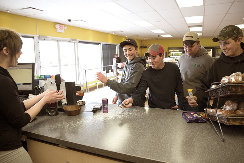
Top 10 takeaways from Legacy Village Market

Top 10 takeaways from Legacy Village Market:
- Create a third place. Turn your store into a meeting spot with comfortable seating, coffee, and maybe even WiFi.
- Seek out expert advice when possible. If you’re taking on a renovation at your store, enlist the help of industry experts to ensure no detail is overlooked.
- Prioritize the bathroom. Believe it or not, a clean, well-equipped bathroom will leave a lasting impression on your customers.
- Don’t cram your store to the brim. Ensure aisles are spacious and products are given enough room to be seen on the shelves.
- Draw families in with a clean, safe environment. Appeal to the families in your community and give them a place to stop in for a treat.
- Use the outdoor space. If space permits, create usable space outside of your store with picnic tables, chairs, and even umbrellas.
- Keep windows clear of clutter. Customers and staff should be able to see out of your front windows, and passersby should be able to see in.
- Hire from within your community. In smaller towns, hire people from the surrounding area to further build that sense of community.
- Keep on top of cleaning. Your customers expect to shop in a clean store, so make this a top priority at your site.
- Get into the social media space. Continue to build your store’s community with an online presence.
Read on for more information about Legacy Village Market's success ...
If you’ve ever met up with a group of friends in a coffee shop, whether or not you were aware of it, you were meeting up in a ‘third place’. In his book, The Great, Good Place, Ray Oldenburg argues there are three places in modern society: the first is the home, the second is the workplace, and the third is any social spot where members of a community gather.
Legacy Village Market in Dawson Creek, BC is the definition of a third place. Six years ago, Cameron Schulz and his wife Tawnya knew they wanted to open a store that would act as a much-needed third place for a neighbourhood, so they set out to find a community that needed it.
“When we were looking around at the different communities in our area, we were looking for a site that had been abandoned by the bigger players because it didn’t fit their business model,” explains Cameron Schulz. “In the smaller communities, this third place concept is not there because urban planning ends up being more focused on a vehicular environment rather than a pedestrian environment."
Cameron and Tawnya met with Hugh Large, also known as The Convenience Guru, and set out to create not just a c-store, but a gathering spot for the community. Here's what sets this store apart from the competition.
The bathroom
Yes, that’s right – the bathroom. When customers come out of the bathroom, they often exclaim ‘We want this bathroom in our house!’ and that’s music to Schulz’s ears.

“When we approached our market, I knew that there were a bunch of young families in close proximity to our store. I also knew I wanted to target those with a healthy lifestyle because I wanted to focus on the people who would walk to our store as opposed to drive to our store,” says Schulz.
“As with any young family, when you’re out and about, you typically need a place to stop. You need to change diapers or the kids need to use the washroom. There’s nothing worse– and I know this because I had a young family when I started out – than going into a bathroom that isn’t clean, doesn’t have toiletries, is too cramped, and just isn’t conducive to dealing with the needs of a young family,” he says.
“I had a sense that, as weird as it is, how you approach your bathroom says a lot about your business. Customers know you’re committed to cleanliness, that you’re committed to a quality presentation and, most likely, a quality product.” The spacious, wheelchair-accessible washroom is finished with oak, slate tiles, big mirrors, and bright lighting.
The safety factor
“A store’s layout and design can really help ensure the staff and customers are provided with a safe environment,” says Schulz. Before the renovation, the store’s shelves were too high, the aisles were too long, and people couldn’t flow through the store. People were essentially trapped in the store, he explains.
“The design from Hugh has provided us not only with an effective sales-per-square-foot ratio, but also a very easy environment to keep clean and keep safe,” says Schulz. “We have been robbed, but the people in the back area getting coffee could see that the cashiers at the front counter were being robbed and they stopped it. This was really important.”
A clear sightline is important from the outside, too. “We have a policy where we do not post anything in the front windows. If you look at my store, you will not see a single poster. There are two reasons for that: first, I paid good money for my real estate that I’m on, and I don’t believe anyone else should be promoted for that. The second reason, and the more important reason, is that if you clutter up the windows, you’re cluttering up people’s abilities to aid with the safety of your store, both inside and outside,” he says.
