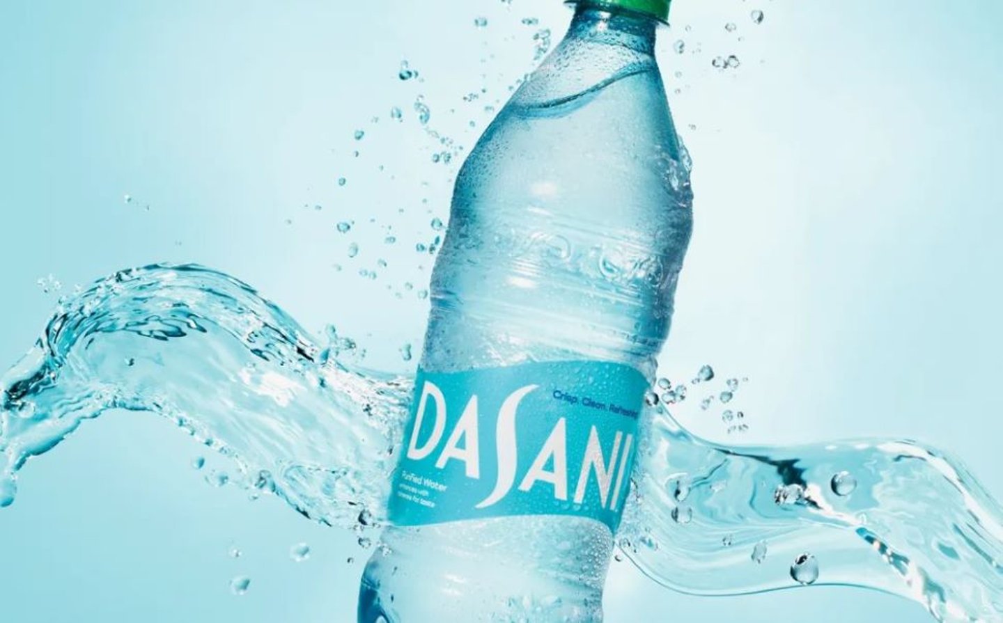
Dasani coming with refreshed packaging, formula and campaign
Dasani is springing into spring with a fresh new look, taste and marketing campaign.
Coca‑Cola Company’s well-known water brand is unveiling a new visual identity system (VIS) across all packaging and communications. The refreshed design aesthetic is anchored in a lighter “celeste blue” color palette and wave inspired by the “S” in the Dasani script.
“Dasani was one of the first mainstream water brands to hit the market 25 years ago, and has endured the category’s changing landscape,” says Shawnika McPherson, brand director, Dasani. “We’ve modernized our logo and label to better stand out on the water aisle with a premium, calming look and feel.”
All 100% recycled Pet Dasani bottles — 20-oz, 1-liter, 1.5 liter and 12-oz. — will continue to sport green caps showcasing the brand’s longstanding sustainability credentials.
Dasani is also tweaking its formulation in response to consumer feedback, by removing sodium chloride (salt). The previous formula contained a dietarily insignificant level of salt, a mineral and electrolyte originally added for taste.
The brand’s first major marketing campaign in five years — “Life Happens Between Sips” — will showcase this new VIS to consumers by focusing on how Dasani plays in the authentic, “in-between” moments of everyday life, the company says. Creative targeting Dasani’s core health- and cost-conscious demographic across multiple channels, including broadcast and streaming TV, social/digital and out-of-home. Collaborations with retailer partners will build shopper awareness through in-store displays and sampling activations.
“Dasani is a ‘we’ brand, not a ‘me’ brand,” McPherson said. “We’re an accessible water brand friends and families share over a meal, at a game, concert or birthday party — and really wherever life happens — a message hope to send with the ‘Life Happens Between Sips’ campaign.”


